
| HOME | ||||||||||||||||||||||||||||||||||||||||
| GALLERIES | ||||||||||||||||||||||||||||||||||||||||
| IMPRINT | ||||||||||||||||||||||||||||||||||||||||
|
||||||||||||||||||||||||||||||||||||||||
| COMMUNITY | ||||||||||||||||||||||||||||||||||||||||
| CONTACT | ||||||||||||||||||||||||||||||||||||||||
| STORE | ||||||||||||||||||||||||||||||||||||||||
| ABOUT ME | ||||||||||||||||||||||||||||||||||||||||

PREVIOUS |
|

NEXT |
|
|
Return to Page 1Interlude #2: FrankenpaintingOr How to Scan A PaintingPage 2Step 4: Color Adjustment
Now to bring our monster to life. The last step is tweaking the color and contrast in order to get a cohesive whole. During this step, if possible, keep the original piece of art in front of you and well lit (but not over-lit) in order to achieve the most accurate final file. Pick one layer that represents the most important, dynamic area of your picture. The piece will look either too light or too dark. Sliding the middle slider will affect this. Move the slider until the layer's full range matches the painting. If, after you have adjusted the Mid Gray slider, you need to tweak the black and white sliders, feel free to do so. Soon you should have one layer with accurate values. Next come the colors. Close the Levels tool and open the Hue Adjustment tool. You should immediately see a Master hue gradient. As it changes depending on your version of Photoshop (or other software), find out how to select the individual hue families - red, yellow, cyan, magenta, blue and green. You can adjust the brightness (or value, or how light/dark the colors are), saturation (how intense the colors are), and hue of the entire color range (Master) or of each individual color family. You will, in fact, do all of the above. Since this issue is about scanning a large piece and not about color theory, I am not going to go into detail on the different color aspects. Hopefully, if you are not familiar with them, playing with the sliders will make you comfortable with them quickly.
As with lining up the layers, you now have to adjust each layer individually, starting next to the layer you adjusted first and moving away, one layer at a time. Repeat the Level/Color adjustments for each layer. Because they are each slightly different, each layer will require slightly different changes. The first layer is always the roughest, though, so the rest should go more quickly. As a final check, now zoom out until the whole piece of artwork is on the screen, then zoom out another time or two. At this level, any differences in color should stand out more. If the whole piece appears seamless, the hard work is done. If not, zoom back in and make more adjustments to whichever layer is not yet correct.
Step 5: Final Touches Crop any excess white space around the painting but leave any unclean edges and a little space. Hopefully you have been saving as you work. If not, be sure to do so now. Then flatten the piece so that everything is on a single layer and save the new file off as a TIF file. Again, use a name that will make sense to you - blueflame_clean.tif, for example. This TIF file will be much smaller than the PSD you have been working with and, because the TIF file format is a standard, it can be read by just about any printing house or operating system you might need. You now have a file from which you can create any new file appropriate for various uses- prints, bookmarks, your website, etc. Simply crop as desired, adjust the resolution to fit the need, and save it off as a new file. With practice, you can do the entire process in about an hour or two (or faster, who knows? Don't think you are limited by my speed!). As a final recommendation, I suggest you follow up this work by archiving all of the files you have just made. I have talked about archiving before in Issue 12, so I won't do so again here. Prologue Remember that this isn't the only way to get your artwork onto the computer. You can take a picture with a 35mm camera or a high-quality digital camera. This involves setting up lighting and lining the camera up with the artwork and other issues I don't have real experience with. Or you can take the artwork to a professional photographer and pay to have your artwork shot. The scan-and-stitch process does take a little time, careful work, and good software. You have to decide whether it is right for you. Hopefully the next IMPrint will be back onto the Bazaar. Until then, enjoy the artwork, and thanks for reading. Return to Page 1
|
|
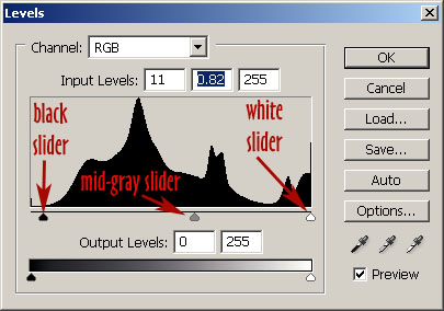 Open the Levels tool (under the Image->Adjustments menu in Photoshop). Move the two end sliders (for black and for white) to get the highlights and darkest darks to the proper values. Once you are happy with them, you are ready to move the middle slider (representing middle gray).
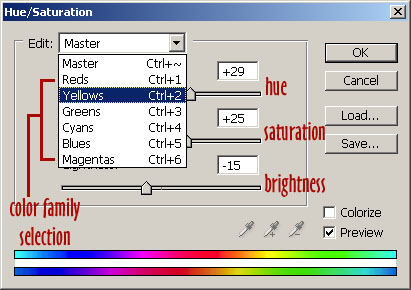 The easiest place to start is Master. Usually the entire piece will either be too under saturated or too vibrant, too yellow or too blue, etc. With the artwork nearby, you should be able to quickly adjust the overall layer colors correctly. You may notice that perfection at this point is often impossible. If the reds are saturated enough, the blues may be too saturated. If the Greens are the correct shade of green, the purples might be too blue. After you have done your best with Master, start selecting individual color families and tweak them until everything is perfect.
RETURN TO THE TOP
|
PREVIOUS |
|
NEXT |
Join the David Deen Mailing List
The contents of this document are copyrighted
2002-2005 by David Deen.
Send webpage suggestions or comments to
email@daviddeen.com.
This document last updated Mon Oct 2 11:00:31 2006.
This document last updated Mon Oct 2 11:00:31 2006.