
| HOME | ||||||||||||||||||||||||||||||||||||||||
| GALLERIES | ||||||||||||||||||||||||||||||||||||||||
| IMPRINT | ||||||||||||||||||||||||||||||||||||||||
|
||||||||||||||||||||||||||||||||||||||||
| COMMUNITY | ||||||||||||||||||||||||||||||||||||||||
| CONTACT | ||||||||||||||||||||||||||||||||||||||||
| STORE | ||||||||||||||||||||||||||||||||||||||||
| ABOUT ME | ||||||||||||||||||||||||||||||||||||||||

PREVIOUS |
|

NEXT |
|
|
Raising the RoofAnd so, at long last, we get to the part where I actually show some technique.
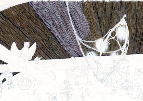
Introduction to the processI like to work from the background to the foreground. This has some disadvantages. The biggest one, in my opinion, being that you have to draw around all of the objects in the foreground. This can lead to problems later and interrupts the flow of shadows, textures, etc when you hit something thin crossing the background. On the other hand, it lets me lay down the approximate values so that I can get the objects in the foreground right the first time. And more importantly for me, it saves the "fun" stuff for later. If I do the background first, I can have fun with it while still looking forward to the creatures in the foreground. If, on the other hand, I color the creatures first, I lose interest in the background before I start it. Basically, it's a big psychological game, but recognizing it doesn't stop it from happening. The simple fact is that if I color the background first, I really enjoy it and don't rush it. The final word on order is that you have to work on your piece in the order that feels right for you. That said, it made sense to me to begin with the ceiling. I ended up using five different colors in the ceiling. "Ended up," is perhaps misleading because I'm not actually done with the ceiling yet. It's good enough for now and I won't go back to it until I've finished the rest of the piece. Only then can I adjust the fine details of shadows and tone. The five colors, in simple chart format:  In prismacolors from left to right: Indigo Blue, Tuscan Red, Dark Umber, Bronze (not metallic), and Yellow Ochre. (People familiar with standard oil or acrylic paints will know the first three as being fairly analogous to Prussian Blue, Alizarine Crimson and Burnt Umber)
A Five-Step Program
If At First You Don't Succeed...... and to be blunt, you won't succeed at first. To put it another way, you don't know how dark, light, yellow, or whatever, the ceiling needs to be in order to blend with the rest of the picture. Are the edges dark enough? Are the cracks too distinct? Even if you've done a full-blown grayscale layout of the patterns of dark and light, the white of the page around the ceiling will trick your eye into seeing a dark ceiling. So at this point, you simply have to accept that it's good enough for now. When the rest of the room is done, spots will need to be revisited, darkening portions, adding hints of blue here and yellow there, until it all fits. I already suspect that the ceiling needs to be darker. But how much darker can only be decided after I've filled in most of the rest of the piece.
|
|


RETURN TO THE TOP
|
PREVIOUS |
|
NEXT |
Join the David Deen Mailing List
The contents of this document are copyrighted
2002-2005 by David Deen.
Send webpage suggestions or comments to
email@daviddeen.com.
This document last updated Sun Oct 1 20:29:29 2006.
This document last updated Sun Oct 1 20:29:29 2006.